PCA of bulk RNA-seq data
Table of Contents
Introduction
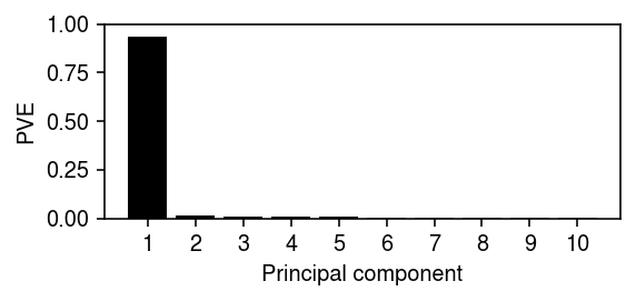
Jean Morrison observed that the first principal component explained 97% of variance in a bulk RNA-seq data set, and the loadings were highly correlated with per-gene mean expression. Here, we show that this result is expected when analyzing the gene-by-sample matrix – it corresponds to the fact that variation in RNA-seq levels can be adequately described simply by a mean and a variance per gene.
Setup
import numpy as np
import pandas as pd
import sklearn.decomposition as skd
%matplotlib inline
%config InlineBackend.figure_formats = set(['retina'])
import matplotlib.pyplot as plt
plt.rcParams['figure.facecolor'] = 'w'
plt.rcParams['font.family'] = 'Nimbus Sans'
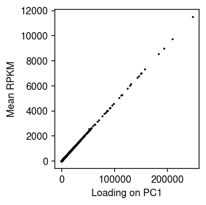
PCA of GEUVADIS RPKM
Read the matrix of RPKM.
dat = pd.read_table('/project2/compbio/geuvadis/analysis_results/GD462.GeneQuantRPKM.50FN.samplename.resk10.txt.gz', sep='\t')
dat.shape
(23722, 466)
Compute the truncated SVD.
fit = skd.PCA(n_components=10, random_state=1).fit(dat.iloc[:,4:].values)
Report the variance explained by the top PCs.
plt.clf()
plt.gcf().set_size_inches(4, 2)
plt.bar(np.arange(10), fit.explained_variance_ratio_, color='k')
plt.xticks(np.arange(10), 1 + np.arange(10))
plt.ylim(0, 1)
plt.xlabel('Principal component')
plt.ylabel('PVE')
plt.tight_layout()
Plot the sample loading on the first PC against the mean RPKM per gene.
plt.clf()
plt.gcf().set_size_inches(3, 3)
plt.scatter(fit.transform(dat.iloc[:,4:].values)[:,0], dat.iloc[:,4:].mean(axis=1), s=1, c='k')
plt.xlabel('Loading on PC1')
plt.ylabel('Mean RPKM')
plt.tight_layout()
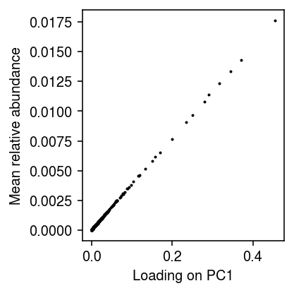
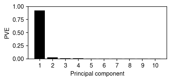
PCA of GEUVADIS relative abundances
Read the matrix of read counts.
reads = pd.read_table('/project2/compbio/geuvadis/analysis_results/GD660.GeneQuantCount.txt.gz', sep='\t')
Compute relative abundances.
temp = reads.iloc[:,4:].values
lam = temp / temp.sum(axis=0)
Compute the truncated SVD.
fit_lam = skd.PCA(n_components=10, random_state=1).fit(lam)
Report the variance explained by the top PCs.
plt.clf()
plt.gcf().set_size_inches(4, 2)
plt.bar(np.arange(10), fit_lam.explained_variance_ratio_, color='k')
plt.xticks(np.arange(10), 1 + np.arange(10))
plt.ylim(0, 1)
plt.xlabel('Principal component')
plt.ylabel('PVE')
plt.tight_layout()
Plot the sample loading on the first PC against the mean relative abundance per gene.
plt.clf()
plt.gcf().set_size_inches(3, 3)
plt.scatter(fit_lam.transform(lam)[:,0], lam.mean(axis=1), s=1, c='k')
plt.xlabel('Loading on PC1')
plt.ylabel('Mean relative abundance')
plt.tight_layout()